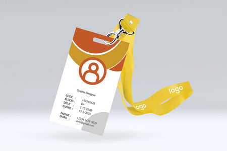
Six factors to consider when You Design Your ID Badge

1. What information will be featured on the cards?
First things first: start by making a list of the data that needs to be included on the cards; your design will revolve around this list. Consider the examples in the box at the right. Will all this information fit on one side of the card, or will some be placed on the back?
2. What will the photo look like?
Larger ID card photos are easier to verify and typically provide higher quality and better resolution. Consider the color and style of the background of your photos. White backdrops help the image pop and keep the overall look of the card clean, while colored backdrops are an easy and inexpensive way to visually classify groups of people, by department for example.
3. What design elements will be included?
Your ID card is a reflection of your organization’s identity and should include your company’s primary fonts and colors. Choose a font and font size that will be easy to read (sans serif fonts typically work best). Solid color backgrounds help make the badge's information stand out more effectively and are easier to authenticate.
4. What orientation will work best?
Depending on the arrangement, your logo, employee photos, barcode, and other card elements may fit better in a horizontal or a vertical format. Longer logos or text fields will look better on a horizontal orientation since you won’t have to shrink the font size or wrap the text to fit in the allotted space.
5. Will the card contain security features?
If you’ll be using cards with embedded security or data features – such as a holographic seal or barcode – determine where they will be located on the card so the card design can accommodate the feature.
6. How will the cards be worn?
If you won’t be using badge holders, you’ll need to consider the location, shape, and size of the card slot for lanyards, badge reels, and badge clips since the slot punch will interrupt the design layout.
